
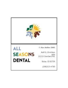

- Description: My revision of business cards and stationery for my dad’s dental office.
- Process (Programs, Tools, Skills): I used Adobe Illustrator to create the logo, and then inserted the logo into Adobe InDesign, where I laid out the final product, added text, and then exported both.
- Message: This dental office is friendly, warm, and will be there for all seasons.
- Audience: anyone, especially people who are scared of the dentist.
- Top Thing Learned: InDesign is not my favorite Adobe program, it can be clunky and awkward to use, but if you know her tricks, you can create great stuff
- Color scheme and color names:
- Big split complementary
- Dark Red, Light Blue, Medium Yellow, Dark Green
- Title Font
- Name: Cassanet
- Category: Decorative
- Copy Font
- Name: Calibri
- Category: Sans Serif

November 11, 2015 at 3:22 AM
I love your use of white space on this project. It compliments the busy but lovely logo that you created. It also helps to bring the most important aspects of the design to the for front. The idea of using separate sections of your logo for the footer of your letter was very creative,
LikeLike