
Final Copy
- Description:
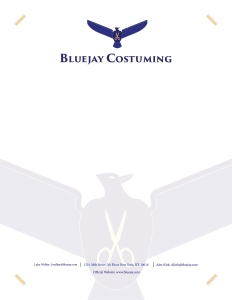
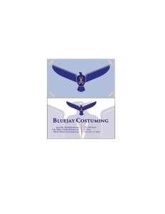
- A letter head and business card for a fictional company that provides high quality costumes for film companies, and individual cosplayers
- Process:
- I first tried different names and logos before settling on a bird for it.
- I then tried different logo designs of that bird before settling on a modified version of the first logo.
- After thinking it over, I changed the name of the company to reflect a new color scheme I came up with.
- I then created a draft of the letterhead, and business card and got some feedback from a few people.
- I made sure to focus on contrast with colors and alignment.
- Critique Report:
- My Mom didn’t have much to say this week other than words of encouragement.
- Facebook Critique: None
- Instructor Critique: She mainly recommended that I loose the border my original design as it made the layout appear cramped.
- Message
- These guys arent some on off costuming brand from china. They make quality stuff.
- Audience
- Anyone looking for a good quality costume this halloween, or for a film they are making.
- Top thing learned
- I learned to not assume that people will automatically know what your logo means at first sight. I also learned that to make any design really good, you need to focus on the details
- Color scheme and color names listed
- Complementary: Indigo (Faded, Medium, Dark, and Darker), and Gold
- Title/Copy font & category listed
- Title – Tarajan Pro 3 (Serif Font)
- Copy – Minon Pro (Serif)
Original Drafts


Original logo ideas


October 28, 2016 at 12:23 AM
Hello Jaren!
I love being able to see your completed design! I love the cohesion that you have throughout your letterhead and your business card. The repetition is awesome! Way to go!
Check out my design: https://kaleymichelledesigns.wordpress.com/2016/10/27/7a-letterhead-and-business-card/7akaleysullivanbusinesscardfinal/#main
Also check out Emilys design! She had some really cute graphics.
https://emilyrose111.wordpress.com/2016/10/27/business-identity-project/comment-page-1/#comment-13
LikeLike
October 28, 2016 at 10:57 PM
Hey Jaren. I really like how it all turned out! I think that the watermark on the paper looks really nice, very professional. I also like your color scheme! The blues look really nice. I think this all together has a really good feel, and everything you’ve made stays pretty on brand. Good job!
Check out my blog, https://emilyrose111.wordpress.com/
and Madisons, she’s got a cool design! https://madisonbcomm.wordpress.com/2016/10/27/business-identity-stem-tutoring-services/
LikeLiked by 1 person